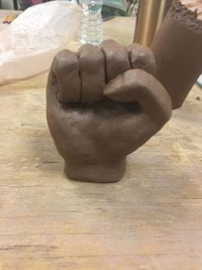
I am in the final stages of the first two art pieces of the year. I had to reglaze my fist because I didn’t read the label of which glaze I was using, so I used peach glaze all over my piece instead of clear glaze. That did not look pretty so I just reglazed my piece and made sure to read the labels this time. I decided to glaze this piece with some of the many flags of the different countries in Africa and other countries that a majority of black people inhabit ( Haiti, Jamaica, etc.) I did this to show how even after Africa and its people were divided by the people who conquered their land. apartheid, and relocation, we still all unite together under the common belief of one day obtaining the equality that we’ve so desperately been righting for, not only in America, but across the globe. My second piece is the portrait bust that is loosely based around a Wakanda woman. Wakanda women are some of the strongest heroes from the movie “Black Panther”. This movie takes place in a country, Wakanda, that was never colonized, so its population is the purest form of African people. This movie was something that shook society and gave a huge sense of pride for the black community as we finally had our “own” super heroes. Wakanda women are some of the strongest heroes that unite with each other instead of trying to tear one another down. They uplift each other and I feel like that is the one thing the black community is missing. We all feel a strong sense of pride in ourselves but we’ve allowed beauty standard to divide us. For a while, lighter skin tones were seen as more beautiful than darker complexions. This has lead to some black people of darker skin tones dismiss people of lighter skin tones when they voice the struggles of being black. We are not in competition with one another to see who has it worse in life. We are here to lift each other up, no matter how dark or light your complexion is. This bust portrays the beauty of black features and the power this community of women hold.
Blog Post #1
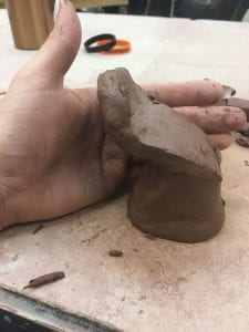
- So far this year, I have started working on a pride fist sculpture. I’ve never really worked on a sculpture before so it was a new process for me. I wasn’t sure where to start for a couple of days; However, once I made s souls base for it I was able to progress at a quick rate. I haven’t really experienced many problems except for starting the base. One thing I did learn as I was making my fist was that adding all of the fatty tissue before I attach the finger to the base really helped with making it look realistic as well as cutting down on the time I spent making it. I also learned how to create my fist in proportions I also learned how to use my proportions in order to make my face look realistic. I feel like that’s the biggest thing that I took out of making this piece so far was how to make something look realistic and how proportions really have a lot to do with how realistic it looks. The next thing I’m thinking about is the glazing of my piece. I have many different ideas on how I plan on blazing it. So far my favorite is the idea I have with having different skin colors that are all attached with Staples so that it makes it look like one hand is several different colors. I chose style because I feel like it portrays a time in my life where I felt like I wasn’t black enough for my black friends are us too black for my white friends. I want this piece per tray that black comes in many different colors and that the color of your skin does not Dictate how in tune you are with your culture
- .


Blog Post 10
I had been working on building teapots on the wheel for about a week. I was not successful in this process but I did get a two good pots to test different glazing methods on. I tested dipping glazes. For my first one, I use Shino as the base coat. Shino has an oatmeal texture. I had to use it first because ” Shino first or the pot is cursed”. I then used Tenmoku on the inside of the pot. I wanted to create a crisp line between the Shino and the Tenmoku but I was unsuccessful. It created these really cool drips due to not being able to evenly pour the excess slip out of the pot. The second pot I did was with wax resist. I wanted to see how accurate the wax could get and if I could get a really detailed. I haven’t fired the pots yet but I think I will definitely be using these glazes in the further because it is a very quick way to glaze your work. For my Africa Bowl, I plan on using wax resist on the black parts and then trying to dip my bowl in clear glaze. I plan to use this coming up year to really explore with my glazing styles and techniques because I have really only been using underglazes and I feel like I should be well versed in all styles.
Blog #9


I’ve been working on planning out my projects better so everything can go as planned ,and I have material for my process portfolio for IB art. I have been making test tiles to decide the best way to use slip transfer on my large utilitarian vessel. I have already glazed a sunset in the back and I wanted to find the perfect way to transfer the animal and women silhouettes without messing out the glaze. I made three test tiles in which I glazed my sunset on the back. I ,then, tried to use the slip trailer to fill in the silhouettes of the women ,but I was unsuccessful due to not have enough control over the amount of glaze that came out and where it would end up. Therefore, I switched to just using a detailed paint brush. For my first test tile, I did only one coat of glaze. With the first test tile, I noticed I would have to completely soak both paper and the tile in order for the slip to transfer. I did not get much transfer with just one coat of slip , so ,for the second test tile, I used to coats. I got more transfer but I decided to try three coats on my third test tile. I got a really good transfer. The entire image wasn’t transferred; however, I could easily go in a and fill in the gaps myself with a brush. With these test tiles I learned that it is easiest to print the image on the paper I used for the transfer instead of trying to copy the image from copy paper. Then, I learned that wetting the test tile and paper, letting it set for a couple of seconds, then laying the paper on the test tile and spraying it with water again helps in transferring the glaze. I even found an easier way to blend my glazes when I was glazing the sunset on the background. Once, the test tiles are fired, I plan on experimenting with using wax to cover the silhouettes and glazing the vessel. I want to silhouettes to be matte but a glossy sunset. I feel like the contrast would be really nice and kind of force you to pay attention to the entire vessel. I want this vessel to represent Africa in its most natural form where the animals roam free and the people do their daily chores ( like how women are in change of gather things like water).
Blog Post #7
In Liz Zlot Summerfield’s video, she used a lot of phrases that could be considered very critical to take into mind when creating a form such as the one she made. For instance, “coaxing it (the clay) into place” in my opinion was a very important part because the “clay is wet enough” to bend;however, we had to let it set for a while so the edges would remain neat when connected the edges. We had to “coax” the clay so that we didn’t potentially snap the walls in half or create a million cracks in the foot. Once we got the walls up we had to “finger tack those in”. This basically meant we had to “[push], starting from the bottom”. We did this on the inside of the form in order to retain the process lines and to keep the neat and not disheveled. For most of us, the “edges did not meet” as a result from “overlapping those bevels”. When we bevels it “[changed] how [the] seams and [the] edges match up”. LZS’s work uses an assortment of lines and shes uses them to feed into the symmetrical pattern in her work. She also sticks to a select color group ( reds, blues, and whites, greens, and browns).
‘Layers’ by Tiffany Schmiere

Tiffany Schmiere is a contemporary artist who’s art focused on the abstract and sculptural. She used bright and vivid colors; however, she usually puts a darker background to make her color pop and it almost gives it a two dimensional look. The specific art I will be focusing on is her sculpture entitled “Layer”. In this form, you can see a a tree growing out of what looks like a rainbow type form. The rainbow is a very common feature in her art work. Instead of painting this one like a rainbow, she hallowed it out and carried the roots of the tree down into it. Throughout this project you can see that see incorporates a variety of colors into her art work yet they still seem to have an earthiness in them even though she uses colors like blue and bright red. She also uses this almost triangular movement in her piece, like the first place I look is the base of the project then up the rails to the top then back down. I am not quite sure of her specific meaning of this project but I believe that it is meant to portray like the circle of life but with nature. Kind of how their is the water cycle and the water is continuously regenerated, this form and the movement of it reminds me of that. She uses a variety of textures that from the coils added in the base for the roots to the ridged lines in the trunk of the tree, to the smoothness of the semi circle and the other little circle that are attached to the tree branches. Overall, Tiffany uses a variety of different colors and textures to help develop her theme and to aid in the movement of the piece. I personally love this piece because it is really busy, like it has a lot going on yet it still is organized and follows together. I am also really impressed with how she was able to defy gravity and make it.
Blog Post #4
I recently finished my first project of the year and I really impressed with it. It didn’t completely turn out how I wanted but I still really like the turn out. I went completely out of my comfort zone with this project. I made the bowl from a slab and used a bowl for the template. I’m used to having complete control over the form of my project but with this I wanted to quickly make the bowl so I could spend more time on the embellishments. The lip of the bowl wasn’t even so I shaved it down then ended up adding little indentations to two of the sides because they had different thicknesses and it was an eye sore. So once I finally a form I was satisfied with I then began to measure the perimeter of the two sides that were enclosed by the indents. Then I divided it by 54 because that is how many different countries have their own flag. So I marked out the placements of each flag and began to paint them on to the surface with, what I thought was matte under glaze, but it turned out that “Stroke & Coat” under glazes have glass -forming properties that give it a shiny surface; however, I did not glaze my project with only the stroke and coat glaze so there were matte and gloss parts. So, when it came out the bisque kiln I reglazed the black base and then did a few coats of clear glaze. I was really skeptical about doing this because I have’t had a good past with glazes because they usually come out really uneven and I just prefer the matte look. However, I think that my little accident turned out for the better because my project turned out really nice. I didn’t really experience in other problems other than just getting tired of painting on the flags. There were many times I just wanted to put the project up and finish it later in the year I knew that this project would be the basis for the rest of the year, so I wanted to make it as well as I could. I think this project taught me that planning out your project beforehand makes it a lot easier; however, it also taught me that my strengths are in slab building. The only problem with slab building bowls is that you have to use a template bowl so you do not really have much wiggle room with what form you can create. I was still able to add little indentations to my bowl that was not on the template. Overall, I think this project was a really good start to the year and it stepped me out of my comfort zone (especially with the glazes). I am also really proud that it was displayed in the art show. When my parents and I were looking at it, a lot of people kept saying that they loved it and it was a really good representative piece.
Blog Post #2
For my first project of the year, I plan on making a big serving platter like dish. I want to connect it to my heritage by centering it around Africa. My first sketch was just a drawling of Africa with the countries outlined in it. I drew the flags for each country in it. My first plan was to make a 3-d model of it but I soon realized that it would be extremely difficult to do that because the edges were so rough a rigid. So, I decided to keep the concept but put it on a platter. I also was not fond of the fact that their were some countries that were significantly smaller than others, so in order to portray them all equally, I decided to put the flags around the rim of the platter. That left me to deciding what I was going to do with the outline of Africa. I chose to put it in the center of the platter and use a tribal print in it. Then, the negative space between the outline of Africa and the flags will be either white or black. I will choose this upon finishing the piece because I want to see how much if which colors will be present, so I can sort of balance it out. For instance, if there’s a lot of reds, blues,and blacks I will use white; however, if there are a lot of oranges, yellows, and greens I will use black because I think it will make it pop more. My inspiration came from things I have just associated with African culture. I also wanted to make it on something that everyone will see. I hope that when put see this art piece they can sense the pride I hold in my heritage. The reason why I am so adamant about it is that I have been told all my life that I’m not “black enough” which is awful to tell someone. So, recently, I have been trying to connect more with my heritage because I think it’s a beautiful thing.
blog post #3
So far, I have created work that shows my extensive thought into the form of the vessel. I made it into a platter/bowl form that is a very useful thing. Instead of making it into a vase that just kind of sits in an area to look at, I wanted to make something that can be used so people have to engage with me piece. This form is trying to communicate my sense of cultural pride by having the cut out of Africa in the center with the bands of flags around the lip of the bowl. Since I highlighted Aftrica, it’s the first thing you look at when you see the piece. I applied new methods , such as using water colors as a temporary outline for my bands, as a way to ensure that my project would remain neat and tidy. I used a method of building this form that I hadn’t used since the beginning of pottery one, which was using another bowl as a guide for your bowl when you’re building it. I ended up having to shave down the sides a lot due to not keeping the lip straight. I will remember next time to cut the lip with a little more precision so I won’t have to end up changing my whole form;however, I actually really like how my piece turned out after I shaved the sides down. I ended up adding little indentations to the side so the bowl could be easily gripped. My classmates helped me in the process of building this by helping me decide which direction to go and telling me what they think would look best. For instance, I asked aloud if they thought I should put the flag surrounding Africa or on the lip in a band. A majority said I should put it around the lip because it kind of cares the African tribal type theme. This really helped me because where I place the flags has a huge impact on how people will look at my project. I developed a focus in my projects by focusing on how to attract people to my project through making a focal point that isn’t something people see other. For instance, usually you have perfectly smooth plates/ bowls that you plan on letting people use. I added texture to mine which makes you look at it longer. Then your eyes travel to the flags around the lip and you realize that it is bowl centered around Africa and if you continue to analyse it you will begin to think about how in African culture, bowls, platters, and tea pots are something they hold very sacred, so this just reinforces my point. My sketches were made in order to make sure that I had a set path in how and what I wanted to portray in my piece. I considered a lot of different thing when planning this, such as shaping the plate into Africa, but I thought it would a very hard project to start of with
blog post #1

 The past week and a half, my group and I have been working on the reject letters. We received the letter ‘K’. You would think it would be hard ,but last year, I received the letter ‘S’. While making that letter, I learned that if you just wait until the clay is leather-hard after you built it, it will stand perfectly and not collapse. So far, we have constructed the entire letter. Each person had their own part in the project, for instance, two people would cut out the slabs, while someone else scored them as we needed them. Then, two other people would actually construct the letter. Another person would help with making coils as we needed them also. I, personally, did a little of everything. I felt like I was very knowledgeable about slab building considering I did it for a majority of last year. For instance, I learned that using a just water instead of slip helped make the process more clean and tidy. Since I wanted this project to be successful, I wanted to be as accurate as possible. We can upon only one problem as a group. After we put all of the wall together, and we were going to put the top ‘K’ face on, we realized that it was too small. We don’t really know what happened but we were able to kind of curve the walls in and add clay to make it fit. That was really the only problem we had. As for glazing our letter in ‘Dazzle’ I noticed that it is kind of hard to come up with patterns that don’t take away from the fact that it’s a ‘K’. Like, finding a pattern that doesn’t alter the shape.